Sorry, wrong term. I meant stairs.
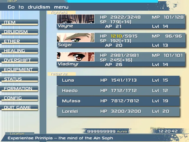
Jaffer, looks pretty good. I imagine a lot of work making all those numbers with charactersets. I just think you should do color shifting when equipments give better or worse status. For you who made all that, making just some characters coloring would be a challenge.
Vivi, I like it. Pretty nostalgic tho :P
Craze, I ilke the RTP edits. Just try to make something with that ladder cause it is kinda strange. .-.
-----------------------------------------------------
Menu mockup. Nothing programmed yet. I'm just getting some avaliations on this structure.

Vivi, I like it. Pretty nostalgic tho :P
Craze, I ilke the RTP edits. Just try to make something with that ladder cause it is kinda strange. .-.
-----------------------------------------------------
Menu mockup. Nothing programmed yet. I'm just getting some avaliations on this structure.

Wonderful outcome, DS!
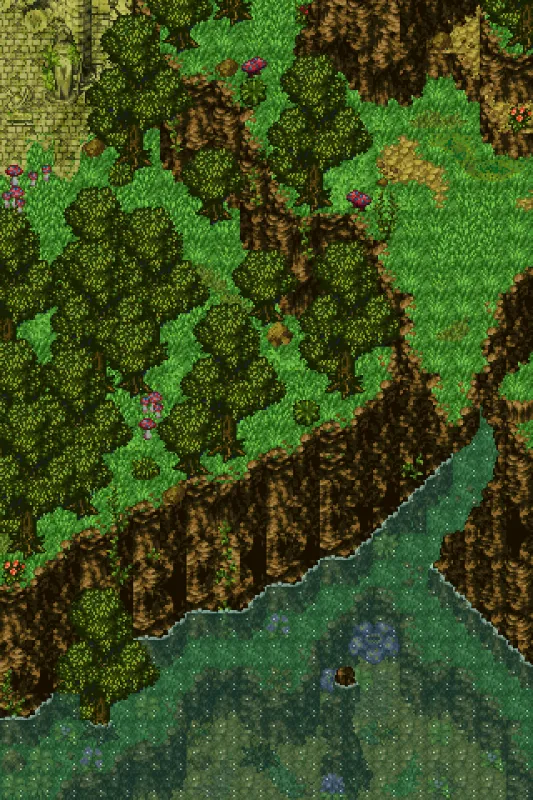
It has a large variety of levels without being confusing. It takes work to make that. I also like the waterfalls, they are just pretty.
It has a large variety of levels without being confusing. It takes work to make that. I also like the waterfalls, they are just pretty.
Fixed somethings on my last screen, based on your sugestions:
+Underwater vegetation;
+Personal water tile for objects inside water;
+Another part of the map.

+Underwater vegetation;
+Personal water tile for objects inside water;
+Another part of the map.

You could put the charsets somewhere where they fit and you can use the move charset event to move them to where you want to on map load.
I don't think it's really necessary though. It looks good.
Yeah, I know that trick. :3
Actually I've been thinking of a easier one that is making the charset of the plant already below a water tile(I mean, the water already included on the charset). Anyway, I just wanna take the mushrooms out of the water.
Actually it's because 2k3 chipsets woudn't permit space for me to place underwater vegetation together with all other things the chip needs. Charsets also won't serve because the water is already a charset.
Of course I might take somethings out of the chipset.
Do you think a different vegetation underwater is really necessary? :l
Of course I might take somethings out of the chipset.
Do you think a different vegetation underwater is really necessary? :l
I've been working on this:


http://img232.imageshack.us/img232/4167/cbsmockup.png
This is a mock up of the final CBS I’m making but some of it is coded (and by some I mean very little) I just filled in the missing parts. also every single monster and boss will be fully animated (idle, status effects, multiple attacking animations ect) and when a monster dies it doesn’t disappear, instead it stays which will let other monsters revive them (And most undead monsters revive themselves after five turns if any other monsters are still alive).
I also got rid of Mana and replaced it with Energy, it works like this, Attacking cost 15 En, That characters En will increase by 15 points and will slowly deplete, once it reaches 0 that character can perform an action, monster also use En though you can’t see there’s.
I’m also planning for a combo system (known as stacking).
I just think you're occuping too much screen space unnecessarely for a CBS. Maybe if those red-filled bars weren't sooo big, you might place huds for HP/MAXHP(I suppose you're just placing the current HP there).
With a smaller red-filled bar, you could place things like this:
[Name]
[Current ][/Current]/[Max ][/Max]
En: [En]
[red-filled ][/red-filled]
Though I must say your bar is very beautiful.
Also I think that hud showing monsters name is really unecessary. I would place the action hud on that space, and make another hud on the top of the screen. The hud on the top of the screen would explain function of the moves/itens and show monsters' name when targeting(like FF7). With that, you woudn't need to place the action hud in the middle of the battlefield(that doesn't sounds well).
Here's something I made for a brazillian community award. Theme was posting a screen of a terror scenario.


http://gamingw.net/pubaccess/24310/CamelJoe.png
Much to my surprise, someone actually whipped this up for me on a whim. I'd like to thank Mblack for the sprite.
I think it fits pretty well with everything else... Oh no; wait. It's original sprite work; so I'd best protect it!
http://gamingw.net/pubaccess/24310/CamelJoe2.png
I know it's yellowish because it's desert style but I really think these maps could be a little more... colored. Maybe you could search for cactus chip parts and other desert plants by the net. It would really enhance the map.
Do Romancing Saga's trees look strange?:


Editing post... Sorry, this was supposed to be on SS topic.


