- One who desires power..
-

- Group: Member
- Joined: Jan 9, 2008
- Posts: 350
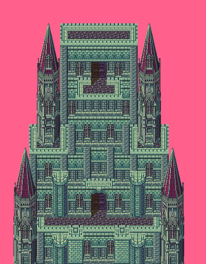
Uh yeah, it was pretty easy if you ask me, but took alot of time to make, besides, mixing tilesets with RMXP is fun 

The image gives off a really metallic and bland feeling, try icons instead of text or both. The connectors for the squares look like steel pipes, try to make them look more flat; try using less pixels for your borders, everything looks like it's popping out and gives it a really cheesy-3D effect. I think it'd look better if the squares were larger. Some status windows and explanation of what each square unlocks would be nice and probably make the system better looking. In FFXII you got some kind of hint as to what each square would unlock, try something similar to each square so players wouldn't get frustrated spending points on a square they didn't really need.~

Is that Goku?LOLWUT , no, but I did make him, nice huh?