Fuck yeah Unguided, you just articulated it beyond my level, and now I can say what you said when people ask me about it.
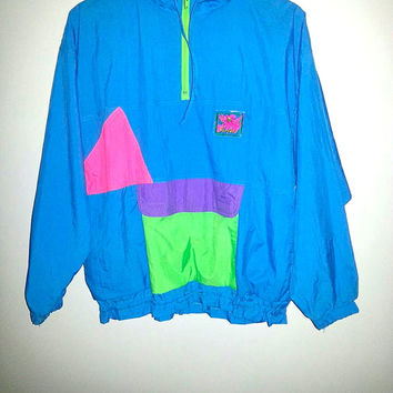
I think the slimy, mutant, toxic greens of the 90s (and 80s of course) were like the best colors ever. Green/yellow combo too. also
green/pink. Just maximum destabilized ugliness. 2010s mostly I only see weak/diet design second-guessing things and trying to fit them in between positive recollections of the 90s and the traditional marketer/executive's avoidance of anything cool or good, slightly less and less so as marketers realize that people like stuff that isn't boring too. Not that that didn't happen twenty years ago, but everyone was so excited about the new technology that the bar for a professional product was so much lower, and so much more human-looking, because the artifice was more visible.* this has been discussed to its fundamentals here. Much more purely, innocently designed.
Greens, greens. All I care about is <greens>. Make the whole world green.


And of course this classic - when's the last time you saw a flatly gradated RGB rainbow like that on TV??? That would get the kibosh now for being ugly and weird. (Just like the rest of the commercial for that matter haha.)

* (I compare it to paintings - it goes lack of realism, abstract representations for a while, then techniques are slowly developed until suddenly you can make things look ALMOST EXACTLY LIKE REALITY!! and then that's all anybody does ever for 600 years because realistic renditions of boring bible and greek shit are the only things anybody will pay for. Video game technology is currently going through precisely the same thing, except better, since you can make and distribute your own stuff without REQUIRING a patron.)
 Gaming World Forums
 Dump topic for stuff thecatamites/bonzi_buddy/etc. might like